GNOME 3.10, the latest version of the popular free and open-source desktop environment, was released earlier today bringing with it new features, apps, bug fixes and interface enhancements.
But that’s all a bit vague sounding, right? You want to know precisely what’s new and worth looking out for.
We hear you – so join us as we run down 10 of the best changes appearing in this sumptuous stable update.
GNOME has always been about making things simple for users, and the revamped ‘System Menu’ in today’s release certainly does that.
The newly-named ‘System Status Menu’ groups together all of the indicators and applets one would’ve accessed individually – WiFi, Bluetooth, Volume, etc. – into one super-compact über-menu.
By transitioning to a more concise drop-down menu GNOME say several issues with the previous design havenow been addressed:
- Small icons were difficult to aim for with a mouse
- Screen brightness didn’t warrant its own applet
- User’s name being visible was a privacy concern
- Information was split out requiring multiple clicks
The new System Status Menu offers a quick overview of the ‘information you care about’, say developers. Options for WiFi, power, etc. are now hidden out of sight until you need them.
Welcome additions to the menu include a brightness slider, improved airplane mode, and connecting to WiFi networks from the menu is now more coherent.
GTK Client Side Decorations
The most striking visual change in this release is without a doubt the new GNOME ‘Header Bars’.
Header Bars merge titlebars and toolbars into a single element, giving more screen space to window content.
But aside from making more efficient use of screen space, Header Bars are also able to change to display controls and options related to the current view of the app:
Finally, following GNOME’s controversial decision to drop the minimise button from app windows, the only control left visible is that of the close button.
Software Centre Preview
he first of several app previews in this release is GNOME’s distro-agnostic ‘Software’ store.
I say ‘distro-agnostic’ as, in theory at least, it will use data from the system it’s installed on – in Ubuntu’s case that means you can search for, see, and install the same apps as in the Software Centre.
Though a ‘preview’ – i.e. far from feature complete – it already covers most of the more common software-management activities:
- Install and remove applications
- Install software updates
- Search for applications by name
- Browse for apps by category
More features are planned over the coming months, including software ratings and application screenshots.
Application Pager
The Activities Overview was rejigged a little in the March stable release, separating out applications into two tabs: ‘Frequent’ and ‘All’.
GNOME 3.10 hones the usability of the ‘All’ section by adding ‘pagination indicators’ to the side of the screen rather than, as before, simply presenting them as an endless list of icons.
It’s a subtle change, admittedly, but it’s one that gives the Activities Overview a cleaner look.
GNOME Music (Preview)
GNOME’s slick new music app isn’t quite ready to take centre stage yet, but is included in 3.10 as a warm-up act.
Compared to Rhythmbox, the ‘default’ music app in GNOME, it is basic on features. You won’t, for example, find crossfading options, last.fm scrobbling, or an equaliser, but it does play music and let you browse your library by artist or album using a clean, streamlined interface.
As for the future GNOME say that users can expect integration with online music streaming services and UPnP server access to feature.
Definitely one app to keep an ear to the ground for.
Date and Time
It’s not something you use often but, when you do, you’ll notice that the Date & Time Settings have received some design attention, including the addition of a much bigger time zone map.
You’ll also see that a new option – Automatic Time Zone – appears in the main pane. This uses GNOME’s new geolocation framework debuting in 3.10 and used by the new GNOME Maps app (see below).
GNOME Maps (Preview)
Another app preview shipped in this release is Maps.
I seem to be alone in really liking this app, but it’s the perfect example of an app doing one thing and doing it well – even at this early stage!
With GNOME Maps you can
- Search locations & attractions by name or phrase
- Get directions
- Pin your favourite places
- See your own location
- Find local businesses
The application uses OpenStreetMap for data so, if you see something that doesn’t look quite right, you can easily propose additions and amendments.
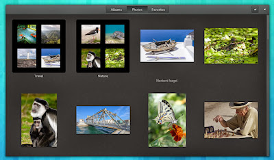
GNOME Photos (Preview)
Another app preview, this time one that focuses on helping you sift through your photo collection.
It’s not intended to be a full replacement for apps like Shotwell. Rather, GNOME Photos gives a better interface for going through folders full of images than Files (‘Nautilus’) does.
It also boasts online features with Flickr and sharing over UPnP.
High-Res Display Support
Google’s Chromebook Pixel, Apple’s Macbook Pro line, and a smattering of Intel Ultrabooks all have high-resolution displays in common. And ‘common’ is an apt word as more PC manufacturers are set to ship these pixel-dense screens in more devices over the coming year.
GNOME are ahead of the curve and 3.10 sees the first iteration of work on tailoring the GNOME desktop for hi-res monitors.
Get Personal
From 3.10, you’re able to personalise the GNOME desktop in some new ways.
For example, you can set a different background for the lock screen to that of your desktop and, if you have Flickr set up in Online Accounts, you can set a desktop background from one of your uploaded images.
#omgubuntu.co.uk


0 comments:
Post a Comment